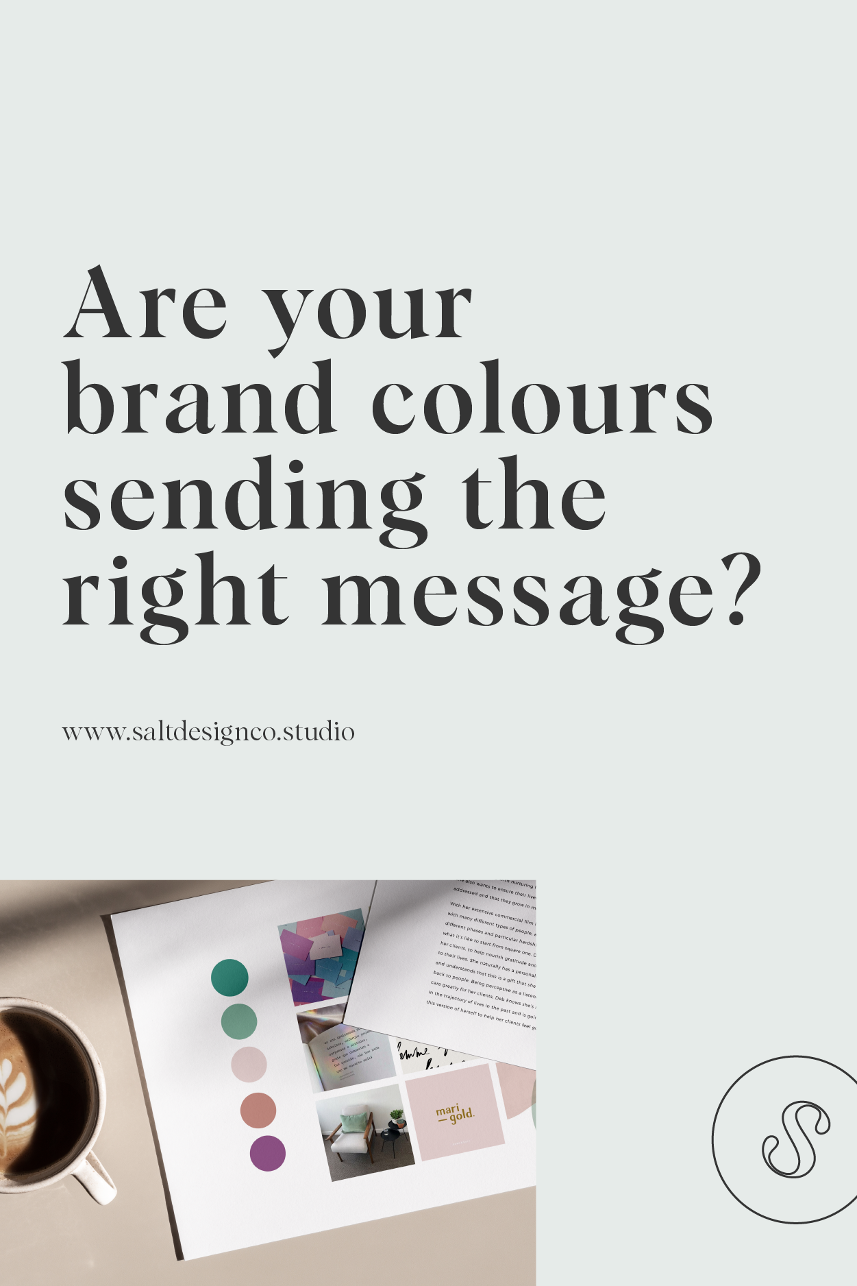
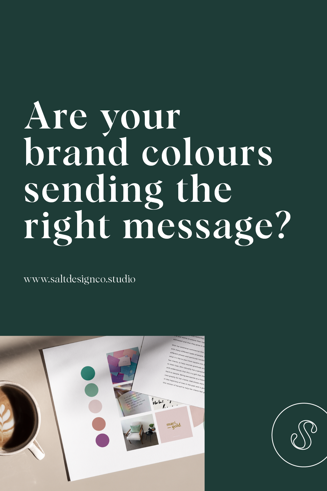
Are Your Brand Colours Sending the Right Message?
Have you ever noticed how many of the big food-related brands use the colour red?
McDonald's, Campbell’s, Dairy Queen, Pizza Hut, Kellogg's, KFC, Tim Horton's, Coca-Cola... there's a lot of them and that's not a coincidence.
What about affordable brands like Home Depot, Tangerine and Freedom Mobile? See the colour they’ve all chosen? Colour has an impact for brands of all sizes and industries and the psychology behind colours can really impact your brand and the message they (subconsciously) express.
Colour psychology and how it affects your brand colours

Colour has been proven to have a psychological effect on people and can actually elicit emotional responses from us, whether we realize it or not, so it's no surprise that these companies have chosen a colour that's associated with attention, importance, energy, passion, and action to represent them. Not to mention the fact that red can actually raise our blood pressure and respiration rates, leaving us feeling hungry.
Emotions play a really big role in the decisions we end up making, so having a tool that can cut straight to the emotional core of people and get a physiological response from them with just one image is actually kind of like having a superpower.
The colours you choose add depth of meaning to your brand. They're telling people a bigger story about who your business is and what it represents and that's because, just like with words, colours have been ascribed implicit and explicit meanings over the course of human history. We draw associations between where we've seen and experienced them before and what we're presented with presently and that helps us make a snap decision about whether its something we like or don't like.
There's even a study that suggests that colours have aided in human evolution by providing "avoid" and "approach" signals and, although most of its findings were inconclusive, it did demonstrate again that inextricable tie between colours, emotions, and experience.
What about your brand colours?

Mood board created for a client of ours, Ease Meditation, back in 2017 – utilizing calm blues to instil a sense of tranquility
The nice thing about colours, when it comes to branding, is a lot of the experiences they're ascribed with are universal, meaning the effect they have will be the same on a very broad audience.
We all understand blue skies and clean water, so for most people blue becomes associated with positive feelings like safety, tranquility, trust, and openness – it’s one of the reasons banks and clinical settings use blues so frequently. They want you at ease and trusting them!
Of course, there are always rare cases where this isn't true and different hues and tones of a colour can actually end up having different effects, so it's always important to do your research before you commit to something, but overall you can be sure that the colours you choose for your brand are going to be telling a story that helps develop an emotional bond between you and your audience.
So, have a think on the colours you're using or want to use and consider the kinds of messages they send. Then take some time to define your audience and the kind of emotional response you want them to have to your business.
Are they masculine or feminine? On a budget or looking for luxury? An old soul or young at heart? No matter who they are, there is a colour that will speak directly to them and provide silent, reaffirming cues that your business understands what they need.
Want to work with us to develop your brand colours and brand identity? Send us an email via hello@saltdesignco.studio and we’ll be in touch!
Liked this post? Save it to your Pinterest!