The Difference Between A Brand and A Logo
If the term ‘branding’ is new to you it might not be clear how a brand a logo can differ. You might think to yourself, but a logo is what everyone talks about, right? Surely that’s the part of a brand that matters?
As brand identity designers who don’t design logos separate from a full brand identity, we disagree. Let’s dive in to chat about this more…
Okay, so yes, there are some logos that really stand out on their own, but they are far and few between; think about it, how often do you actually care about those unique, beautiful logos? Do you pay attention to the company that the logo is from? Does that logo make you more likely to buy from that company? The answer, probably, is no.
Now, think about big brands you love, with products or services you keep going back for? Can you think of their logo…? Is it especially unique or clever?
Let’s use Apple as an example here:
Apple’s logo is literally, an apple. It’s simple, it’s recognizable and it easily fits onto all their products. They probably have a logo (somewhere) with the company name in it, but really what you remember is the apple itself. And it’s not a complex or especially clever apple logo. It’s remarkably simple.
But their brand? That’s a whole other matter. Their brand is sharp, crisp, exciting and dynamic. Their products (an extension of their brand) are forwarding-thinking, adaptable, clever and beautiful.
You might think, but shouldn’t their logo encapsulate all of those things too? (i.e shouldn’t MY logo represent all the things that my brand and products/services is?) and as you can clearly see with Apple, the answer is no! That’s just too much for a logo to represent at once – it’s not possible. And honestly, the logos that try to do that, tend to feel cheesy, tacky or outdated, simply because they’re trying to cram too many things into one icon or wordmark. In fact, we can look back to the very first Apple logo from 1976 to see exactly that – a complicated logo that is trying to do too much. Compare that to the newer Apple logo, designed in 2017, and you can see a remarkable difference and impact.
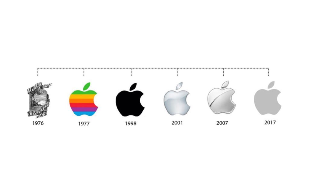
Image from tailorbrands.com
What this example shows us, is that the overall impact of a brand identity, is greater than that of a logo – and, that a brand identity has more SPACE and ability to represent all of the things it needs to. There is simply more touch points and more availability to represent and communicate the brand to customers. Which is why it’s so important to nail down your brand and consider how your customers or clients are engaging with it. All of those experiences, are part of their brand experience–regardless of whether or not they see your logo.
Wait a minute… what is a brand identity?
The short and sweet explanation is that a brand identity is the visual representation of a company’s ethos, combined with styles that will attract its target market.
A brand identity has to represent a company’s values, core messaging, personality and more. As a company (and brand) is made up of many many pieces, it takes many many things to represent them all and communicate them to a potential customer.
Because, ultimately, that’s the goal: to communicate what a company offers, stands for and cares about to a potential buyer; to ensure that a person can glance at different design pieces of a brand and be able to make subconscious choices about it.
So when you think of Apple, what comes to mind? How would you describe it to other people? You might describe Apple as innovative, modern, sleek, young, creative, friendly, and cool. In the end, you know what sort of company it is just from looking at its visuals and experiencing the products.
A brand identity is made up of the following items:
A primary logo
Secondary logos like monograms, submarks, icons, etc.
The brand font system and colour palette
Any illustrations, patterns or other decorative elements
HOW the above is used
Language and messaging used (for websites, social media posts, etc.)
In all, a brand identity is the visual way a company communicates with a customer. It’s how we interact with a business, how we feel about it and what we understand it to be and care about.
The brand itself extends beyond the visual identity too! It’s about how you feel when you engage with a brand. How does a brands visuals (instagram posts, advertising, products, etc.) make you FEEL? What message do you take away from or about it? (either consciously or sub-consciously). All of those feelings stem from a well articulated brand strategy and brand identity.
So where do logos come into this?
A logo, on the other hand, is a graphic element or typographic mark that visually represents a company and its name.
It is created with specific colours, shapes, and typography choices that add to the identity, but as we’ve seen above, it is just one part of a brand identity.
Keep in mind too that a logo doesn't have to be a direct, literal representation of a company’s product or services. For example, the Nike logo is a swoosh, is not a running shoe. Their logo works as a visual cue for the ethos of the brand; flight, movement and speed. A great logo is unique, creative, and clear, and can effectively express the brand behind it!
What a logo is not, is a representation of EVERYTHING within a company. It’s impossible to put that much into a small icon or the visuals of a company name, and trying to do so often results in unattractive, cluttered, hard to read logos.
Hopefully that clears up the difference between a brand and a logo for you. Feel free to comment below if you have more questions about either, or email us at hello@saltdesignco.studio if you’d like to talk about creating your brand identity together!
Liked this post? Save it to your Pinterest!