Case Study: Type C Consulting
In 2021 Type C Consulting founder, Connie came to the realization that the brand identity of her business (also designed by us in 2018!) wasn’t representing her true personality.
Originally created to be professional, feminine and striking, it was lacking the true depth of Connie’s spunk and style. While this was more of a trend back in 2018 (to represent yourself “professionally” and not as your true self), times have since changed and Connie had not gotten full use out of her brand identity.
So, she knew something had to change if she was going to make the most of her investment and accurately represent her brand online.
Brand Design
The problem:
Original Type C Consulting branding was feeling too “professional” and not full of the sass, spunk and style of founder Connie’s personality
Clients were hiring Connie for HER, not just for her professional demeanour and excellent standard of work
Disconnect created as the brand identity didn’t fully represent the person clients were hiring, so the experience didn’t feel as true and authentic as it could be
The strategy:
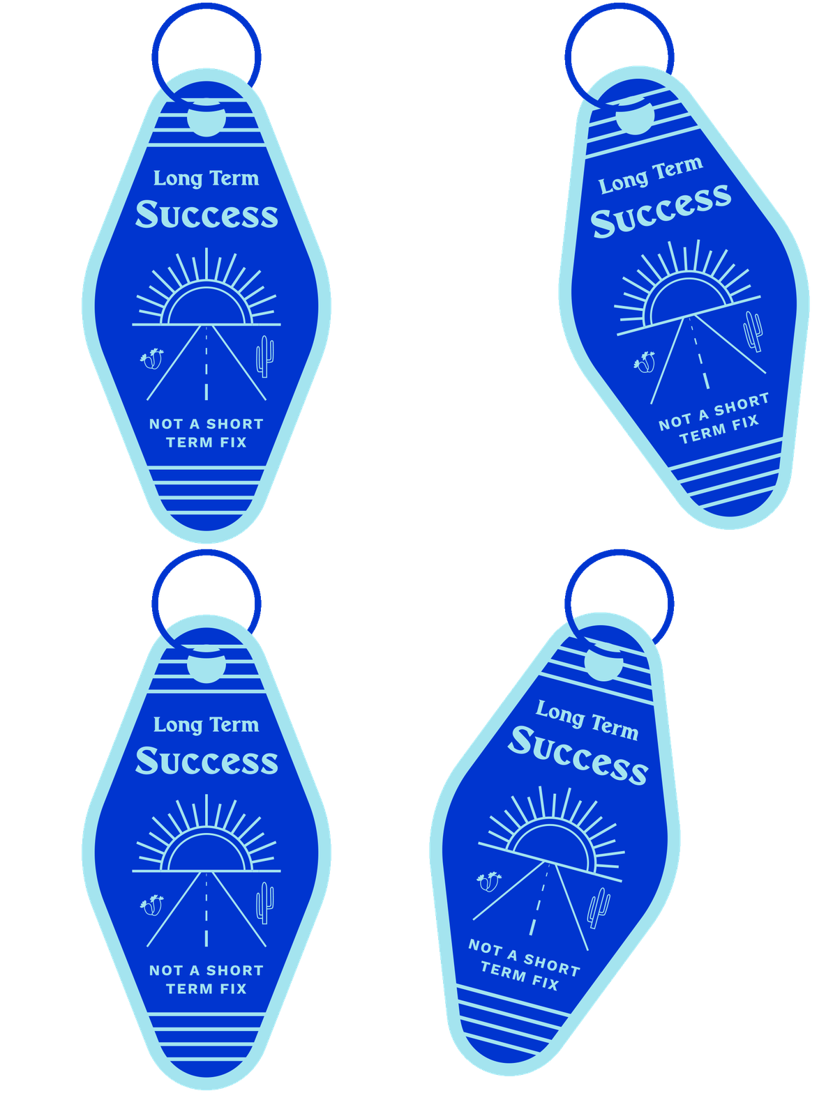
Update the brand to be more in line with Connie’s personal style by using 70’s inspired colours, shapes and graphics
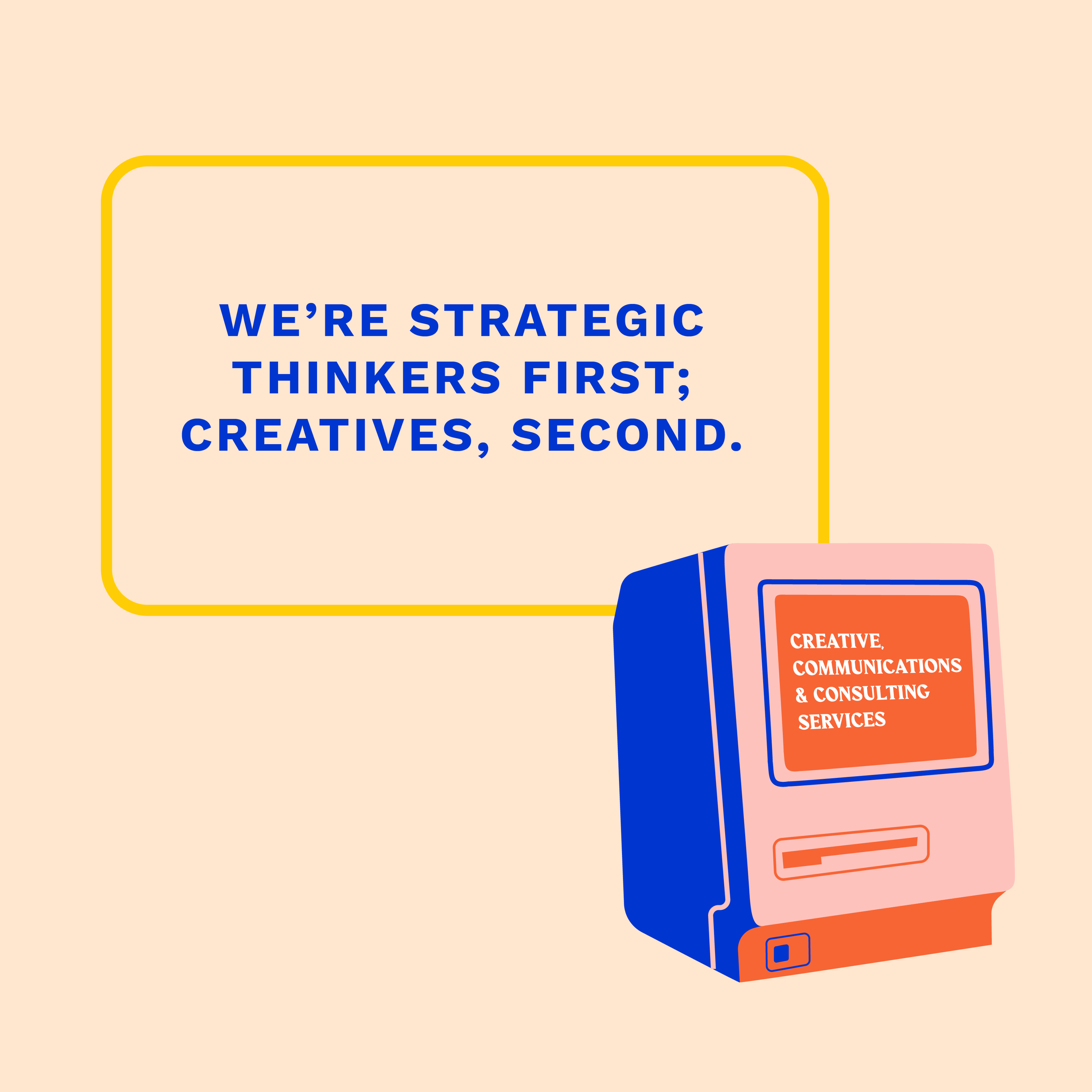
Bring more personality and sass into the brand via punchy taglines and copy
Create animated stickers that evoked a feeling of nostalgia, spoke to Connie’s bold approach to business and tied the personality and visuals together
The results:
A bold, personality filled brand identity that feels totally in line with who Connie is and how she approaches design and business
Animated GIF stickers that can be applied across her website, socials and other marketing materials
Custom button stickers for the Type C Consulting website
An updated logo set with company tagline for the more professional brand materials like business cards etc.


